The DJIA is at an all-time high, but how much of it is “real”. Earnings growth dropped to negative two quarters ago, so that removes some of the fundamental appeal of a new high. Comparing economic parameters to the last time markets were at these levels does not offer a favorable context either.
There are ways to judge “extreme” valuation mismatches between fundamentals and market momentum or exuberance. Sentiment surveys offer some insight in contrarian fashion. If everyone is bullish, who is left to buy? (and vice versa) Similarly, if there is a high level of “money” committed in stocks, not only is it “who is left to buy”, but “with what money”.
The infamous “cash on the sidelines” argument has been used repeatedly in the past few years, but I don’t think that captures the full measure of potential resources. Banks and brokers can “create” cash out of nothing, through margin balances. The relative comparison between cash in brokerage accounts and margin usage reveals more depth to investor sentiment.
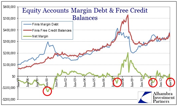
In the big picture, extremes in cash vs. margin match up extremely well with market inflections. Throughout the latter half of the 1990’s, margin usage grew much faster than overall cash levels, as did market prices.
The following data, except as noted, is taken from FINRA member filings pursuant to Rule 4521, and includes data from both NYSE member clearing firms and previously designated NASD members. “Free credit balances” is composed of both free credit balances in customers’ cash accounts and free credit balances in customers’ securities margin accounts. “Margin debt” refers to debit balances in customers’ securities margin accounts. Net margin is the sum of both free credit balances minus margin debt balances.
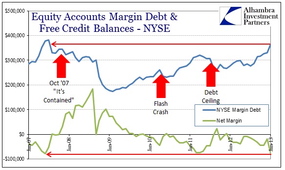
The dot-com bust is shown beginning with extreme leverage in equity accounts. Net margin was an all-time level of -$131 billion, on total margin of just below $300 billion. Over the course of the equity market collapse and into the housing bubble, net margin balances fell more in line with free credit, forming a largely stable relationship.
By 2007, however, investor comfort with leverage was again heading toward an extreme as stock investors became very complacent. Net margin reached -$60 billion by the end of June 2007, on total margin of $408 billion. Margin balances hit a new high in July 2007, but cash balances had already begun to rise, denoting a change in investor risk assessments.
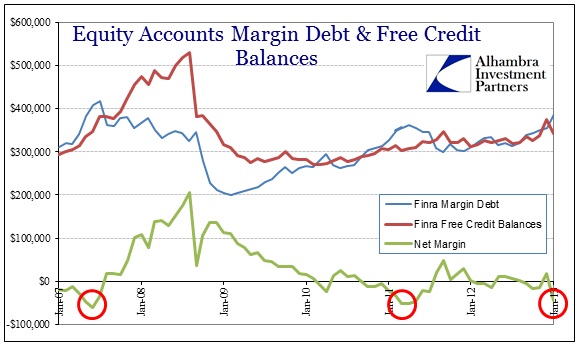
Extreme readings on the other side marked the end of the panic phase as well, as margin usage dwindled all the way below $200 billion by the end of February 2009. The market hit its bottom only a little more than a week later.
Since the market bottom, the only extreme measure of margin has been early 2011.
Net margin hit -$52 billion in April 2011, as total margin usage grew back to $360 billion (+81%). That would mark the beginning of another inflection, as stock prices slumped late July/early August 2011 surrounding the debt ceiling and downgrade drama.
Only recently have we seen a return to those more extreme levels of margin and net margin. The latest data provided by FINRA for January 2013 shows a net margin of -$45 billion, with total margin balances of $388 billion – a level above even that of 2011.
The pattern of interchange between margin growth and margin avoidance is one that should be pretty familiar to market and monetary observers.
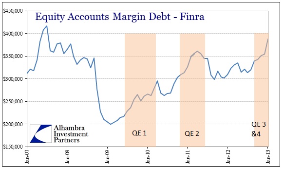
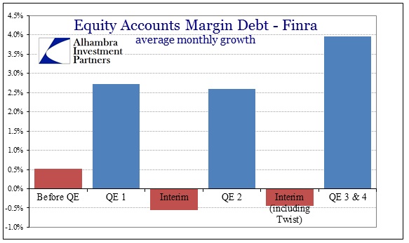
During the episodes where the Federal Reserve was intent on increasing its balance sheet levels, and thus available bank reserves, margin balances rose far more quickly than during the interim periods where the Fed was largely inactive (under this definition, Operation Twist counts as an inactive period).
From January 2009 through January 2013, the pattern is unmistakable. Whether or not there is a direct line of “money” from the Federal Reserve to market makers to margin debt creation or the impacts of QE work through the psychology of investor expectations does not matter here (though it makes for very interesting conversation and conjecture that might be more relevant and important in the near future). What matters is that there is a high correlation between the Fed’s activities and margin debt levels, and that there is a further correlation between margin debt levels and stock prices.
In terms of measuring potential inflections, though the FINRA data shows net margin below both the 2011 & 2007 extremes, the levels of NYSE firms alone are showing more excess margin than the combined data.
Why that would be the case is unclear as there does not seem to be any readily apparent explanation for increased risk-taking among NYSE clearing firms compared to their formerly NASD counterparts. It is clear, however, that the NYSE segment of the market has backed into extreme levels not seen since the first rumblings of crisis in the middle of 2007.
Does this prove that market prices are not real? Of course not, but it provides both color and context in that debate. In my opinion, it adds to the weight of evidence that QE more than fundamental bases have been driving market machinations.
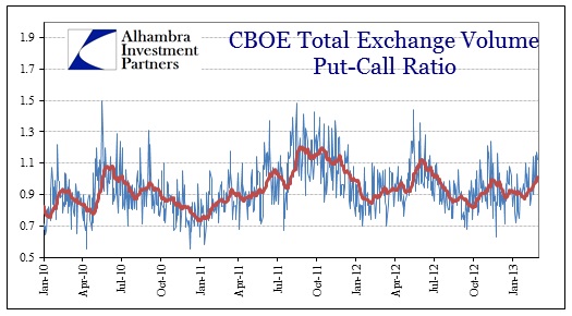
One other note, while margin debt levels have been increasingly exuberant on the NYSE, the put-call ratio at the CBOE has been moving in a more cautious direction. However, since the CBOE data is current, the put-call ratio up through the end of January 2013 is consistent with the margin data cited above. The put-call 20-day average ended January at 0.8745, down slightly from 0.917 at the end of 2012 (for all of 2012, the put-call ratio averaged 0.9323).
Since early February, the 20-day average has pushed back above 1.01 (with the past few days showing readings above 1.12). We will see if there was matching caution in equity leverage, but given stock prices over that time I would wager against that proposition.
We saw this same pattern in early 2011 – the put-call ratio was rising noticeably while margin debt and net margins began to show extreme levels. Within a few months, margin usage wavered and then stock prices followed.

Stay In Touch