
Following up on the payroll disparities that were updated on Friday, it is still difficult to be confident that the economy is on any kind of solid ground. For starters, though the Establishment Survey shows 4.4 million new jobs in the 21 months since October 2012, for an average of 207k per month, the companion Household Survey is only at 3 million, or 144k per month. The difference in the monthly rates is enormous; with one showing what would clearly be a slow enough pace to generate apprehension and the other more toward low-grade historical recovery. However, even that disparity is somewhat misleading, as the base for the Household Survey is more than a little larger than the Establishment Survey (the Household Survey includes some categories, such as self-employed, that are not included in the Establishment Survey), meaning the divergence is as well.
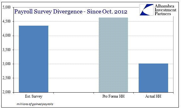
Adjusting for the base effect, the Household Survey “should” be at +4.6 million jobs to match the “mainstream” result. That is rather striking not just in its raw significance, but also in light of the wider context of this cycle. In the 21 months (an equal time period in the other direction) ending in October 2012, both payroll estimates did indeed confirm each other.
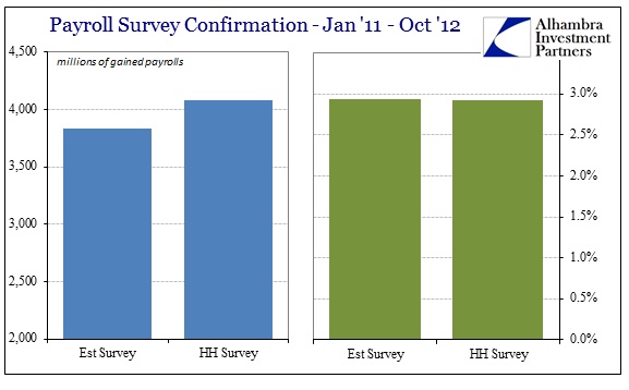
Where the Establishment Survey showed +3.8 million payrolls, the Household Survey estimated +4.1 million employees. On a percentage basis, the results were nearly identical out to five decimal places: +.02929 (Est.) vs. +.02926 (HH). The fact that such similarity abruptly ended, however, does not end the curious nature of all of this.
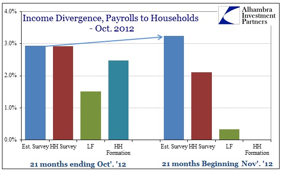
In fact, since October 2012, the Establishment Survey has been accelerating while the Household Survey does the opposite. Total payroll gains in the 21 months ended October 2012 were, again, 2.93% for the Establishment Survey; for the 21 months beginning November 2012 the gain is now 3.2% (owing particularly to 2014’s figures). The Household Survey goes from 2.93% all the way down to 2.1%.
It would be far less concerning, and thus contradictory, had both second derivatives been in the same direction – if the Establishment Survey and the Household Survey were both accelerating or decelerating but at different rates, for example. But the purported acceleration in the Establishment Survey is unconfirmed by pretty much everything else (outside of reconfigured GDP narratives).
As I noted on Friday, both the official count of the labor force and household formation are conspicuously deficient in support of the acceleration narrative. In the time frames presented here, the labor force grew by 2.3 million (+1.5%) before the end of October 2012, but only 516k (+0.3%) thereafter. Total US households were even more remarkable, as growth of 2.8 million (+2.5%) just stopped; -19k (-0.02%).
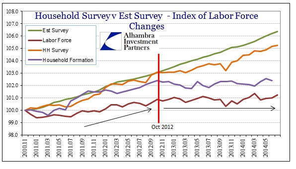
Graphically, October 2012 stands out as exactly that pivot. While I might be accused otherwise of cherry picking starts and ends, the chart immediately above should permanently disabuse any such doubts. That month is not just seminal in terms of these economic accounts, it also happened to be the first production coupon settlements in the Federal Reserve’s third discrete QE application.
I do, however, think the exact timing of these factors is more coincidence than causative, but that does not at all dissipate the potential interrelationship. In other words, rumors of QE3 had persisted during that summer prior to its eventual announcement, as did the actual and significant slowdown in the economy coming out of the last QE episode.
Where any potential causal relationship gets really interesting, and for my money compelling, is in other economic accounts outside labor and household income (which are clearly having a primary effect on the labor force and household formation). Starting with even the newly circumscribed GDP numbers, in the business investment category capex has decelerated noticeably alongside these other accounts (and arguing against Establishment Survey acceleration).
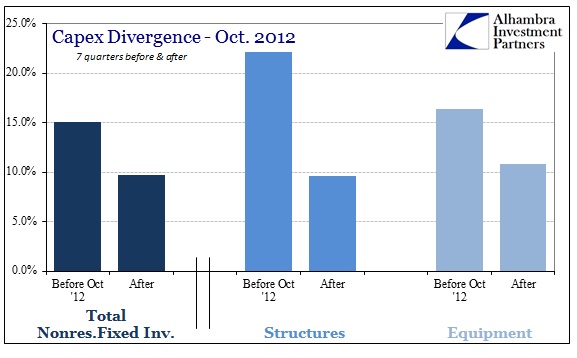
Overall Nonresidential Fixed Investment in the seven quarters prior to October 2012 (again, using the latest revised figures that are actually far more favorable to recent quarters) grew by a total of 15.1% in nominal SAAR. In the same amount of time thereafter, fixed investment slowed to only 9.7%. In terms of capex outside of the newly-created “intangibles”, business “investment” has slackened even more remarkably. Growth in structures slowed from 22.2% before to just 9.6% after. In raw capital terms, equipment investment, which includes the run in transportation, saw its total growth fall from 16.4% to 10.8%.
None of this means, though, that financially businesses in the US have found themselves overly idle. In decades past, there was a much higher correlation between the factors cited above, particularly capital spending, and business proclivities toward debt. Not so anymore, as debt usage and leverage accumulation has accelerated after the October 2012 pivot.
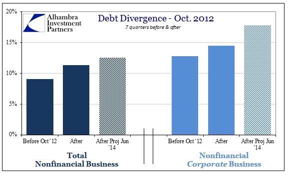
The attraction of debt financing has expanded in the six quarters after QE3 (the latest figures from Z1 only extend to Q1 2014) in greater proportion than even in the seven quarters before its intrusion. Using our own estimates for the second quarter, to equate the time factor and calendar terms, net debt has exploded in the past 21 months (or so) well beyond its prior growth. For some observers, that indicates “recovery” though I think it pretty much argued otherwise by the data shown here. Further confirming that, the imbalance is much wider with US corporations (small businesses are still mostly disinclined toward debt despite the Bernanke Fed’s best efforts at repression).
We don’t have to wonder where all this cajoling ended up, as businesses eschewed productive investment in favor of the financial. However, that is not the only outlet for all this monetarism, as there are, given the pace and scale of junk debt and leveraged lending (bank-syndicated junk debt), undoubtedly many businesses close to the edge that have simply funded their own existence in this manner. In other words, as productive capital expenses and true wealth creation through the trade of labor for cash slowed after QE3, the rush of debt financed instead the growing stock bubble while keeping afloat who knows how many firms that would otherwise be extinct by now (and should be, for the sake of overall economic efficiency).
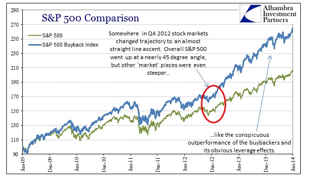
One is easy to see, shown above, and the other is much more difficult. The effect of leverage on stock prices is, I believe, captured well here. We have, however, little direct ability to observe the other phenomena, meaning the state of struggling businesses dependent so much on credit for keeping the lights on a few months longer.
That sets up what is likely self-reinforcement, as the lack of productive investment is a drag on economic circulation, including income, and thus creating more stress on those weaker firms. The monetarist counterpoint is that the rise in stock prices should more than offset the drag through concentrated “wealth effects” on consumer spending. Since record highs in stocks and other risky assets have yet to be distilled into an actual and full recovery (the fact that it is a topic more than five years after the official end of the Great Recession is rather conclusive on that score), any believed “trickle” offset is clearly ineffective as a contra-force to the growing drag of inefficiency.
We can only speculate at this point about actual causation since there are perhaps too many variables and co-relationships to disentangle. It is entirely possible that QE3 is the causative agent (which I certainly suspect to a high, though not full, degree) in that it “convinced” resources to flow in this counterproductive direction, through stock repurchases and struggling firm “welfare”, leading to a growing inefficiency not only of debt itself but also economically speaking. That would mean monetarism did not work as intended, but rather contrary to those stated intentions as it actively siphoned resources away from efficient and productive uses that create sustainable and long-term growth. Such a contrary result would certainly show up as a cyclical inclination toward deceleration beyond that trigger point.
It is also possible that QE3 was just the last node in a string of causative events, tracing back to commodity prices and QE2, whereby businesses noted the slowing economy prior to Bernanke’s swan song and thus were already disposed to utilize resources elsewhere given the established deceleration. In other words, QE3 just gave them a final push in the direction they were already heading.
In either case, it seems quite apparent that QE has had some kind of impact in either “pushing” resources in the inefficient direction, or at the very least kept them moving that way. Neither seems particularly appetizing for the economy-at-large, and both are contrary to the stated purpose that is being actively redefined in the wake of the monetary failure. What is left is more worrisome, however, as at some point the credit flow will begin to scale back and start to reveal all this inefficient misallocation not in esoteric, theoretical notions, but actual retrenchment at a time when the economy is already on the downswing.
Click here to sign up for our free weekly e-newsletter.
“Wealth preservation and accumulation through thoughtful investing.”
For information on Alhambra Investment Partners’ money management services and global portfolio approach to capital preservation, contact us at: jhudak@4kb.d43.myftpupload.com
Stay In Touch