
With last week’s release of the Financial Accounts of the United States (formerly known as the Flow of Funds; still designated Z1 by the Fed’s system) we can add to yesterday’s examination about bubbles and market risk. Putting the figures together, the composite picture is one where stocks are as stretched in terms of valuations to a degree only seen once before, 1999-2000 (maybe twice, as in 1929).
There were significant revisions to corporate net worth estimates to take into account, which forms the denominator in Tobin’s Q. The Q ratio is a simple and intuitive idea about stock valuations as they are tied directly to one estimate of “intrinsic” value.
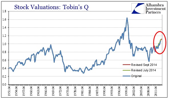
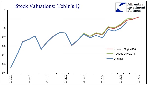
On a long-term basis, the Q has only been this “rich” once before, with the market back at the end of Q2 (the latest figures now almost a full quarter behind) revisiting what was experienced in 1998. The revisions to net worth are more visible in the shorter view, with corporate net worth first revised much lower (increasing the ratio; meaning that stocks were more “expensive” than first estimated) and then slightly only higher in the latest refiguring.
In addition to the Q ratio, we can now look at total stock values compared to nominal GDP.
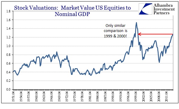
I don’t think this measure adds much in and of itself, given that GDP is likely not the best “deflator” under dynamic circumstances; such as if US companies are gaining more business and profits overseas there should be a rising ratio. That said, however, it does project the same trends as these others and thus reinforces to some extent how valuations are changing and to what degree.
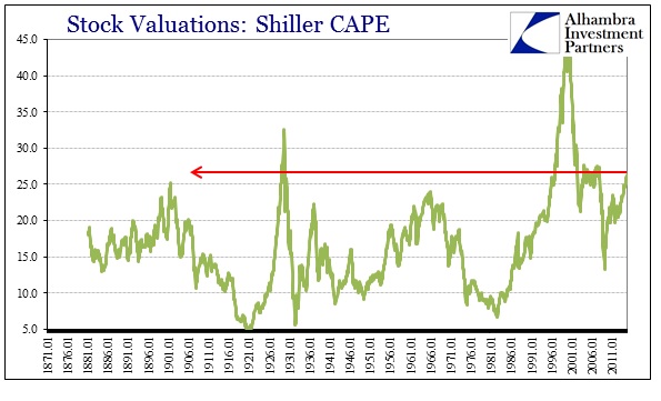
Robert Shiller’s CAPE figure is now back to where it was during the housing bubble, and still above every indication prior to the dot-com bubble save the last months of the 1929 frenzy. That raises the very valid point about what exactly these valuation metrics are telling us. It is one thing to say that the “market” is expensive right now, it is another to extrapolate that into the future. It is certainly possible that valuations can stay “high” for longer periods than otherwise thought possible, the very the case exhibited for the nearly 20 years after 1995. Curiously, none of these measures have really reverted to prior averages and means – for CAPE that means almost the 120 years before 1995.
As Shiller himself has noted on many occasions, his calculation doesn’t tell us much about tomorrow but does give a statistical correlation: high valuations historically correlate with low returns going forward. The CAPE ratio says nothing about how those returns may come about, a slow bear like 2000-03 is just as valid as the crash in 2008, or even a steady straight line market going nowhere (which, I suppose, is possible since pretty much anything is).
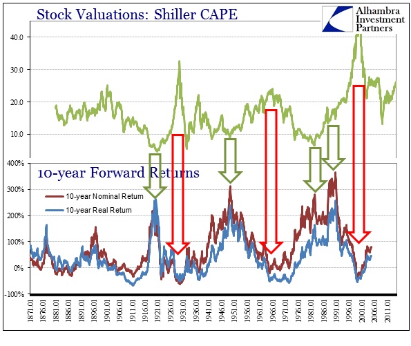
The historical relationship is pretty clear as presented above; a very nice, though not perfect, inverse pattern. When valuations are at peaks, returns going forward (measured here at 10 years) tend not to just be low but near zero or negative. That would seem to put a premium on figuring what constitutes a peak, but in reality the low returns of those periods just prior, even if they are slightly positive, make them practically indistinguishable in any meaningful manner. Again, high valuations of whatever placement tend to lead to lower forward return potential.
This is all very intuitive, though it gets lost in the shuffle of short-term fixations, particularly in the current “schematic” that narrows to whether the durable goods figure this month was +0.1% or +0.2% higher than expected over August, or whether Company X beat its earnings number by one penny or two. Using Shiller’s data for inflation-adjusted prices, from the peak of the dot-com until now the S&P has gained just 0.85%; not per year, total.
If you start your return calculation two years earlier, the total inflation-adjusted return rises to 43.6% which sounds far better but in reality is still pretty much the same deficient result. On a compound annual basis, the inflation-adjusted return from 1998 until the current record high is just 2.2% per year. That is certainly better than 0.06% per year from the dot-com peak, but in reality it is not appreciably different.
And while the CAPE measure was reliable at that time in it telling us not to expect much in terms of return going forward of those extreme valuations, the means to achieve them were two major bubble events, including the most recent stretch that seems so tantalizing to so many despite all historical precedence.
This reversal of valuations to returns is exhibited by the other measures, notably the Q ratio.
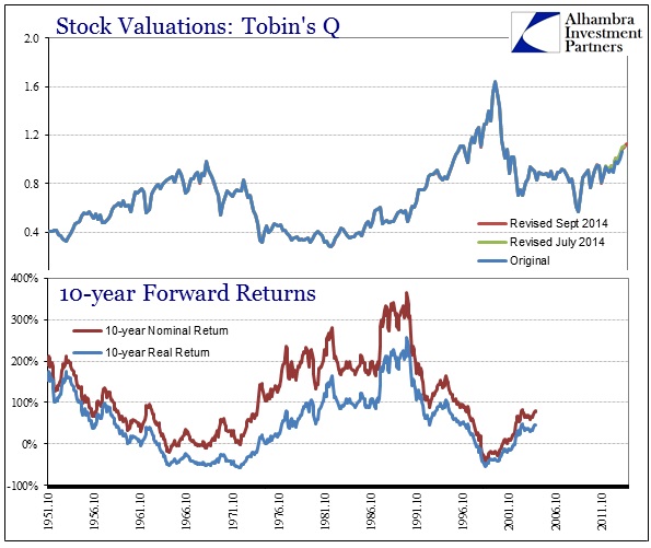
Again, it is not perfect but there is a very clear inverse pattern that features all three inflections (so far, obviously we can’t incorporate 2008’s 10-year forward returns yet) going back to the beginning of the 1950’s. As with CAPE, we see here the plain observation that high returns do not follow high valuations; or if they do, not for very long.
This notion remains despite the inclusion of interest rates, which are often cited as a contra-factor to the valuation observation. In other words, you will hear quite often that PE’s, for example, “rise” when interest rates are low. Thus an extended period of relatively low rates, it seems to follow, would exhibit a sustained episode of greater than “normal” valuations.
That seems to be the case now, as I mentioned earlier how valuations have never really reverted to prior levels. We know all-too-well that interest rates have been moving lower almost steadily since the early 1980’s. That would seem to correlate and thus provide some reasonable assurance of possible causation.
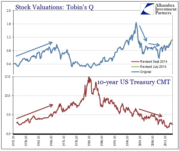
The data, however, doesn’t really show much of a durable correlation. Rather, what seems to have happened is that the now-60 year cycle in interest rates managed to find an inflection at the same time as only one of the stock valuation points. In 1980, interest rates peaked with consumer inflation just as stock valuations bottomed. That one “fit” does not provide anything other than that, though, as interest rate behavior appears very much independent of stock valuation – at some points moving in the same direction for an extensive length of time.
By all accounts here, the stock market is in quite uncomfortable territory. And, as I tried to related yesterday, risk is not so much whether there is a crash tomorrow, it is about the relative opportunity moving forward. The lower the potential gain the greater the possibility of repeating what we have seen now twice just in the past fourteen years. The net result of that has been to go nowhere but taking a lot of precious time to do it.
Click here to sign up for our free weekly e-newsletter.
“WEALTH PRESERVATION AND ACCUMULATION THROUGH THOUGHTFUL INVESTING.”
For information on Alhambra Investment Partners’ money management services and global portfolio approach to capital preservation, contact us at: jhudak@4kb.d43.myftpupload.com
Stay In Touch