
As noted earlier, the Bank of Japan has a whole host of problems over its QQE with YCC attachments. Japan’s central bank has belatedly discovered Finance 101, where being one-dimensional doesn’t actually help the cause of “stimulus.” For far too long official policy has been lower, lower, and lower, whether that was carried out in JGB yields or whether it was found in the yen exchange rate. There are other dimensions to consider, yet until last year central banks didn’t appear to have ever noticed them. Thus, one side of “reflation” has been in the hope that now that central banks have noticed, it will represent the beginning step of eventually finding right and effective solutions.
That is, however, looking too far ahead of the curve (pun intended). To start with, yield curve control is meant to be taken literally. Where my analysis earlier today dealt with the second part, meaning the lack of control and the implications of it, this later version is meant to take the first part – yield curve. We are already in problematic territory where Japan dwells, as a yield curve is a piece of information derived from where bonds actually yield. At -29.8 bps, for example, the 1-year JGB cannot actually be classified as yielding some financial return. We can cloak it in the relativism of comparative values, but those are equally distorted and largely by the same factors (meaning that we are chasing our tails).
A negative yield means that investors are getting paid to hold that paper in other ways. In the form of Japan’s “dollar” problem, represented by a negative cross-currency basis, it makes sense to hold JGB’s at these prices for profit is derived from the basis, not the negative “yield.” Therefore, the determination of yield in that context is merely the element of hedging or controlling risk.
In a sense, that is what a yield curve expresses, a relative demand for less risk in financial opportunity, the squelched curve a fitting description of an economy without it as the tradeoff seeking to find balance one over the other. John Maynard Keynes described a “liquidity preference” for holding money balances among consumers who at times needed reasons to spend rather than maintain liquidity. There is surely a parallel in Japan (and almost everywhere else) only in banking and finance rather than the personal hoarding of money and currency. Thus a “yield curve” might be the measure of lack of opportunity perceived in bond markets as distinct from a yield curve which presents the affirmative judgment.
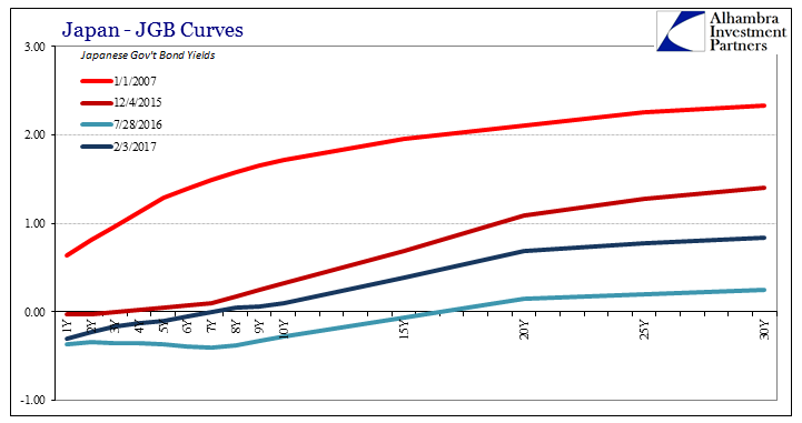
What, then, is the Bank of Japan actually attempting to “control” given this environment? In one sense, it is the clear error of their past ways. We can review the JGB curve history and see the evolution (devolution) of it as a result of them.
![]()
The JGB curve only became this way post-2008. Prior to the panic, the curve was a normal government bond curve. At the outset of 2007, for example, it looked like a bond curve should look even though the Japanese economy at that time had not thrown off the shackles of either the “deflationary mindset” or the continuation of the lost decade of the 1990’s into the 2000’s. The JGB curve, then, represented the economy as it was rather than what it had been earlier under QE1 and QE2 of the economy that was supposed to be.
What we find is, essentially, two parts. The first is the overall shape of the curve, meaning whether the yield curve is actually a curve (as in January 2007) or whether it is something more distorted and less curvy. As you can plainly see above, the one for JGB’s transformed steadily from the former into the latter. This is surely the effect of QE’s and purchasing activity itself.
The second part is the nominal level of the overall curve, or, as later, “curve.” While the shape may be determined by the Bank of Japan, where it falls in the nominal spectrum is perhaps the last bit of market information contained within it.
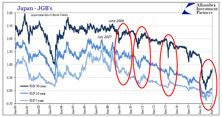
Even as the JGB curve shrunk, it still went through these periodic episodes of “reflation” that demonstrate these two distinctions. At each one the yield curve’s overall shape remains constant, so that what changes is only the nominal level of it.
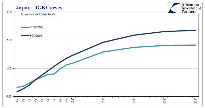
In 2009, for example, the JGB curve had by August that year steepened to an almost normal (for Japan) shape and level. The curve at the end of 2008 was itself a normal looking curve, merely shrunk by the (economic) events of the Great “Recession.” Thus, it moved from flatter-but-normal to steeper-and-normal, a nominal reseating reflecting more positive perceptions of economic opportunity (in Japan terms). This process repeated in 2010, where the curve had flattened in the “unexpected” global outbreak of banking troubles (“dollars”) related to Greece (but not really about Greece).
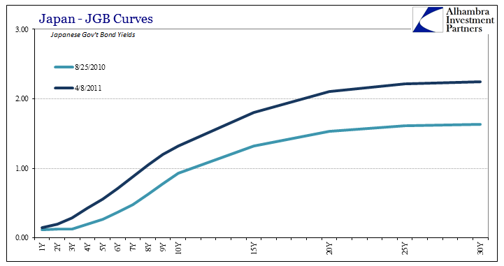
Already, however, you can start to see deformation toward the front end, as the “weight” of additional QE’s (four more by that point) began to create distortions not on the economic outlook contained within the nominal situation but more so bank considerations related to monetary policy transactions (front running). By the time of QQE in April 2013, we see the process of “reflation” repeated but with the overall different curve shape much more warped and at a lesser nominal level.
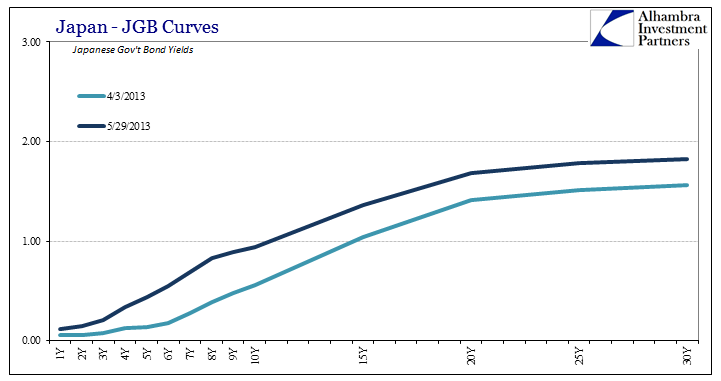
Combined, these two pieces of information simply tell us that the BoJ was trying harder and harder but that it just wasn’t working. The curve became more and more distorted, especially at the front end (pushing further out all the time), but dropped in nominal terms as well. The periodic instances of “reflation”, or whatever you wish to call them, were simply variability as to the probabilities of continued failure (always a little more temporary hope after each one) despite whatever “new” monetary policy was cooked up and introduced.
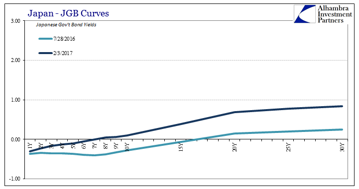
The introduction of YCC hasn’t really changed the yield curve shape as a matter of policy reflection, merely altered the character of the distortions remaining within it. The yield curve remains nothing like a curve, as instead we see the typical “reflation” contained only within the nominal elements of it that are still nowhere near pre-crisis, or even pre-2016.
I wrote back in December that:
Just as bond market participants understood the difference (over time apart from the few exceptions based on risks, such as 2013) between actual rate stimulus (liquidity effect) and low rates due to persisting economic deficiency (income effect), I doubt very much that any new attempts to instead manipulate just the yield curve shape will provide anything more than entertainment as markets adjust to whatever yield curve effect might arise. The standard of interpretation will just shift, as it always does (i.e., if 50 bps in the 2s10s used to be cause for concern in German bunds, bond market investors will realize instead that the 50 bps threshold is now set at 70 bps if it is determined that the ECB’s “steepener” has added 20 bps to the yield curve). That’s already happened to some extent in Japan, where JGB 10s aren’t supposed to be above 0.0%, yet they are and have been (+4 bps today).
In short, you can’t fake a curve no matter how hard you might try. Having so badly distorted “curves” with “yields”, how does one actually go about undoing it? The simplest answer is to stop doing everything, but we all know that central banks will never, ever opt for that choice (at least as long as it is their choice). And so we see the problem from the perspective of the central banks in general, and BoJ specifically. They seem now to understand that there is value to a yield curve (taking nearly a decade of depression to finally “get it”), but seek only the limited circumstance of perhaps allowing the “curve” to be a little less of a “curve” as if that were a meaningful difference. Is there some value in the JGB “curve” looking more like December 4, 2015, and less like July 28, 2016? BoJ might think so, but there really isn’t.
In other words, Yield Curve Control really isn’t about controlling an actual yield curve, let alone turning a “yield curve” back into a real one, but rather trying to deal with the fallout of years of failure by changing as little as possible about operations. The “curve” doesn’t go back toward normal, however, it merely becomes differently distorted because markets aren’t so stupid. They become at times temporarily optimistic and hopeful, but as JGB “yields” that is just a relativistic variance. The hope of this latest “reflation” is captured nominally, which in that relative comparison is minimal, leaving the overall shape to offer what it always offers – nothing. The first step back to actual economic health is opportunity, not variable dimensions of a “yield curve.”
Stay In Touch