
What is the yield curve supposed to look like? It’s a simple question that doesn’t actually have an answer. And because it doesn’t, there is a whole lot of confusion about bond yields. To wit:
Chadha, the chief global strategist at Deutsche Bank’s U.S. securities unit, is part of a group of die-hard bond bears who say Treasuries have become unhinged from reality and yields have nowhere to go but up. Like many before him, he points to all the obvious signs investors seem to be ignoring: higher benchmark interest rates, wage pressures that will lead to faster inflation, worsening budget deficits that will result in more debt issuance.
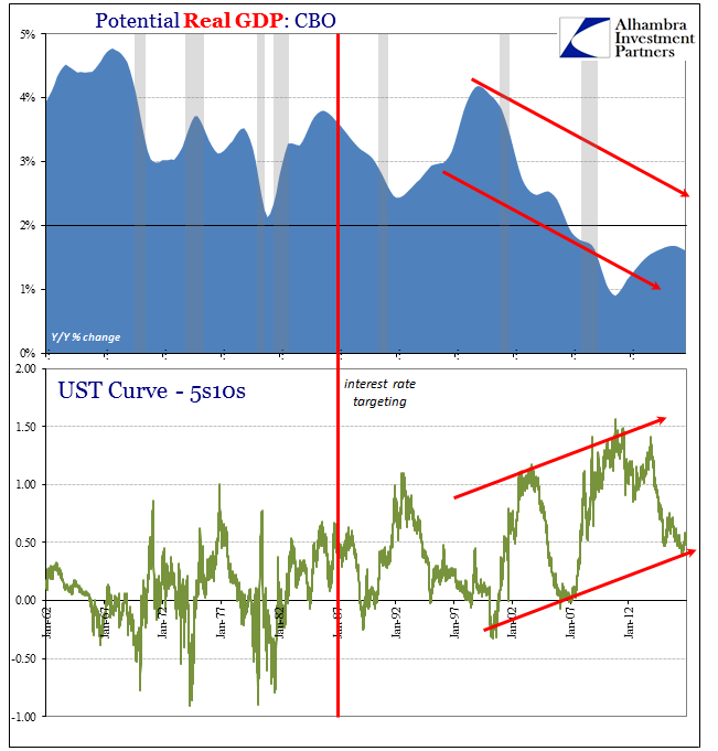
Obvious signs? Your argument is already in trouble if your basis is the unemployment rate, a fact established by none other than the UST curve during the past few years. Interest rates have nowhere to go but up, except that they don’t. The shape of the curve is instrumental in arriving at that conclusion.
When analyzing the yield curve, however, at least one dimension is missing. The yield curve is often described in only two, the difference between interest rates at two points along it. That static description leaves out what are perhaps the two most important dimension, meaning time (as in calendar rather than maturity) and nominal.
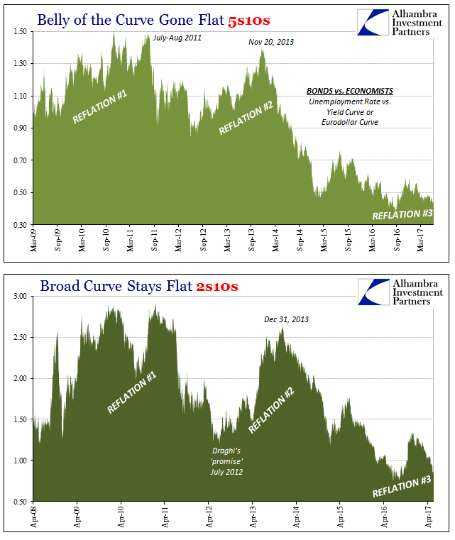
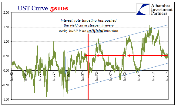
The current yield curve was at the 5s10s yesterday all of 43 bps. Compared to “reflation” #2 in 2013, that is impressively flat, when the curve three and a half years ago topped out at around 140 bps. On May 2, 1983, however, the 5s10s was also 43 bps, as it was on January 10, 1985, as well as October 23, 1987, just four days after Black Monday.
Already you can appreciate some distinctions. Though their shape in the belly, the 5s10s, is mathematically equal these three curves in their other dimensions tell us a quite a bit that was different. In 1983, the US economy was just then roaring into the full recovery from the early eighties double dip, the last truly robust growth period to date. By the end of 1987, it’s not that growth had become poor, it’s just that it had settled down into its baseline or trend after spending 1983 and 1984 well above it.
The PCE Deflator in May 1983 registered 4.57% inflation (currently estimated) of consumer prices, while it would slow more so thereafter. In early 1985, the PCE Deflator had risen 3.72%, almost identical to the 3.73% rate in October 1987. Nominal GDP growth eight quarters ahead (two years) would average 10.4% after May 1983, 6.1% after January 1985, and 7.8% following October 1987.
The yield curve steepening in the front end from 1983 to 1985 was taken under assumptions that proved false; many investors as policymakers were concerned that the return of robust growth after the 1981-82 recession would lead back to conditions like the Great Inflation. Instead, the economy settled down into something quite different (and to this day not fully accounted for). Thus, though the curve shape in the middle was equalized for these three snapshots there were a lot of dynamic changes in between that can only be deduced through relative comparisons.
In other words, what counts are comparative shifts from one time period to the next, rather than hard rules about what a yield curve does or does not indicate through all time. This is an important distinction particularly for the current age where yield curves today barely qualify for the term even if at certain parts they are or recently were far “steeper” than they have been historically.
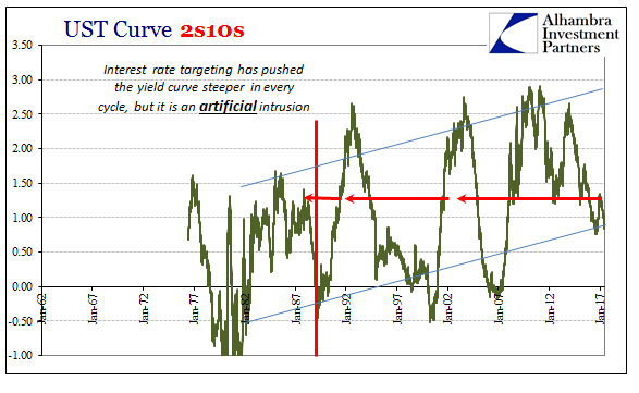
The intrusiveness of interest rate targeting must not be lost on analysis, for while the Federal Reserve may influence the shorter end it has much less to do with the longer end (no matter how hard and how many QE’s it might try). The increasingly steep curve therefore has less to do with the bond market and more of economists who (still) don’t get the bond market.
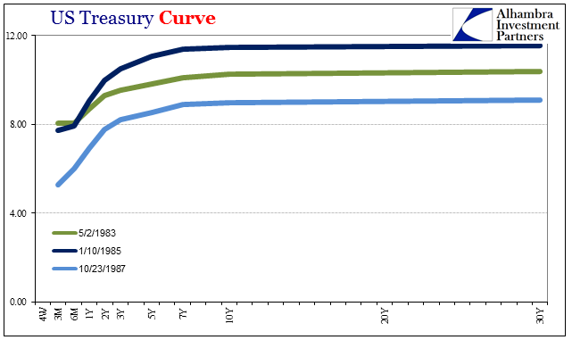
What would the history of the 2s10s look like if the Fed had been successful especially with QE3 and QE4? The surprising answer is that it would very likely have been exactly the same if in just these two dimensions.
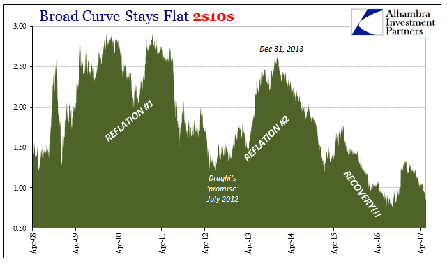
If reflation had actually been that, the yield curve would have steepened initially as it did in the summer of 2013 but then flattened out again into a more “normal” shape over the years that followed – meaning normal as compared to the crisis and post-crisis period. If we add the other dimensions, the clear difference of curve dynamics becomes fully apparent.
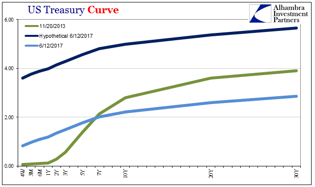
The hypothetical curve is just as flat/steep as the real curve is as of yesterday. Yet, the two curves could not be more different; the hypothetical one which would have flattened after 11/20/2013 would have left us expecting what Janet Yellen was talking about all this time. Using the actual curve shape of other days in that period, we can see how this process would have unfolded – optimistic flattening.
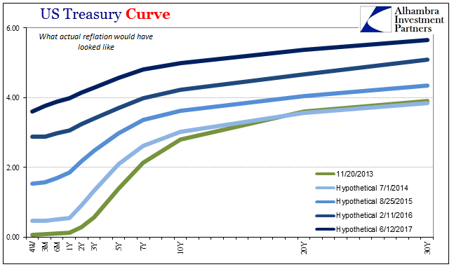
Though their shapes are above exactly the same as the real curves on those dates shown below, the actual results lead nominally to a much different economic as well as monetary (liquidity preferences as well as inflationary pressures) view of the world.
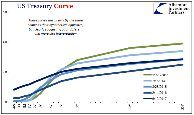
The flattening of any curve, such as eurodollar futures, at such a low point nominally is an entirely different matter than the flattening of the curve at something more normal. Again, if the US economy were actually heading in that positive direction, as it was supposed to have all along, we would expect such flattening.
What that means today is where we started with this. Though the curve is itself in these places such as 5s10s exactly equal to its spread of May 2, 1983, January 10, 1985, and October 23, 1987, it is a curve that is nothing like those periods – just as those curves were different among themselves. The world has changed, shifted into a different paradigm since the Great “Recession”, and analysis must respect that fact. As it flattens all over again in what looks like the (predictable) exhaustion of “reflation”, it matters for all the reasons “interest rates have nowhere to go but up” ignores. There are no “signs” of improvement and Fed RHINOS hold little or no bearing no matter what the textbook claims.
The full dimensions of the UST curve “knows” what economists and the mainstream can’t seem to figure out.
Stay In Touch