
What does it mean to be data dependent? The term immediately conjures up the image of studious Economists working their mathematics to perfectly calibrate the proper monetary policy response. It is attached to the Federal Reserve, and other central banks, but its application is much broader. Businesses are, obviously, data dependent and often in the same way as the FOMC.
There is somewhat of a dichotomy as to how the phrase has come to be used. In strict monetary policy terms, it has evolved from the minor debacle over forward guidance. Without rehashing that silliness (Odyssian vs. Delphic), we are left with what should be straight forward. The Fed, as any business, surveys the economic climate and makes decisions based on subjective interpretations of those surveys.
This is a modern invention for any central bank. In the good ol’ days, the institution wouldn’t need to do this. The bank would content itself with a narrow focus on, you know, money. In fact, in the traditional framework central bankers of ages past would have been appalled at what monetary policy has become – an effort to at least guide, if not completely control, the marginal economic direction.
Without any money in monetary policy, the pursuit has devolved into data dependence. This is even more complicated still. Not only does it require selection of the “right” data set, you also have to be mindful of time horizons. In a lot of cases, time is a bigger factor than any catalog list of statistics.
In October 2016, Cleveland Fed President Loretta Mester described the challenge. Speaking about uncertainty, she told the Shadow Open Market Committee of her disquiet upon seeing the reported results of a CNBC survey conducted earlier that year. According to Mester’s recall, nearly half of financial professionals (meaning economists, fund managers, and market strategists) believed the FOMC’s stated commitment to data dependence pertained mostly to immediate figures.
Mester:
The concept of “data dependence” was meant to reinforce the idea that the economy is dynamic and will be hit by economic disturbances that can’t be known in advance. Some shocks will result in an accumulation of economic information that changes the medium-run outlook for the economy and the risks around the outlook in a way to which monetary policy will want to respond. But some of these shocks will not materially change the outlook or policymakers’ view of appropriate policy. Unfortunately, referring to policy as “data-dependent” could be giving the wrong impression that policy is driven by short-run movements in a couple of different data reports.
A few among us know this problem well, being described constantly as “transitory.” The issue, again, is not just for policymakers to consider but economic agents, as well. How does one go about sorting which unfavorable current data to ignore in favor of a longer-term outlook, and those troubling statistics that indicate one should shift one’s medium or even longer-term outlook because of them?
The idea of “transitory” is quite simple; it is the Fed attempting to do the former. They are saying, in effect, yes, we see that inflation is low (or economic growth for that matter) but we are ignoring it because we believe in our medium-term outlook which we don’t believe will be swayed by the misses (even as they accumulate). The data dependence, then, is not really about those concerning deviations but moreover any other data that might suggest their short-term nature (like the unemployment rate).
But claiming “transitory” year after year (after year after year) dangerously bleeds into the very medium term that isn’t supposed to have been modified. It raises serious issues beyond simple forecast errors.
We have at our disposal a wealth of data concerning that very topic. The Philadelphia branch of the Federal Reserve, the one responsible for compiling the Greenbook, also publishes estimates on forecast errors. This is, as is required by monetary policy absent of money, a necessary task.
Any kind of forecasting is going to be subject to variation; this isn’t physics or cosmology. Furthermore, these inaccuracies also come embedded with their own time element. The longer the forecast period, the greater the variation we can expect.
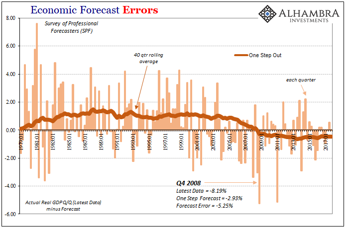
In other words, when evaluating economic predictions, we have to account for a number of factors. For example, if we start with the Survey of Professional Forecasters (SPF), this set of data provides predictions across several “steps” in time. One step out would be a forecast of Q2 2018 GDP made in Q1 2018. These “one step” predictions sport the lowest average errors because they are made closest to the release, and therefore can incorporate near current conditions often including components that will be added into the actual calculation.
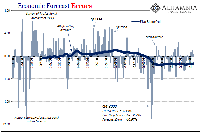
Compare the chart immediately above to the one before it; a “five step” prediction for Q4 2008 GDP suggested nearly 3% growth whereas at one step it was for almost 3% contraction. That makes sense in that in early 2007 no models or Economists thought a major recession was even possible, but after Lehman, panic, and all that happened a big contraction wasn’t any longer such a remote possibility. They were both big errors, but the five step was way off.
Given that, we also need to keep in mind what counts as “accuracy”, especially in the big economic accounts. Something like GDP goes through innumerable revisions, including three of them released each month after the quarter is over. Beyond those, GDP and other series are redrawn sometimes significantly by benchmark changes.
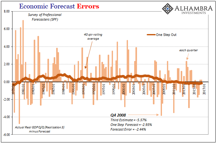
Realization 3, as pictured immediately above, are those figures from the BEA that come out as “final” GDP estimates before any benchmark revisions. That compares to Realization 5, or the latest data, that has been subjected to any and all benchmark changes added on between the time the forecast was made and today.
Errors are smaller to more immediate data than to estimates following benchmark changes. This suggests upon more comprehensive review economic conditions are even further unlike what they were expected to be (in whichever direction).
Using these error projections, we can construct our own fan charts. A fan chart is a graphical expression of uncertainty rather than the projected firmness often accompanying official forecasts. President Mester was arguing, and has continued to argue, for their increased use in conjunction with official policy statements for these reasons.
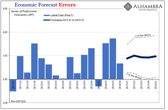
At the end of 2014, the SFP called for about 3% growth pretty consistently out into the future. That’s the trend or figures that went out with policy statements, but it was misleading in that the real interval for these projections was almost unbelievably wide – and at just one standard deviation which only contains about 68% of all (normally distributed) possibilities.
For example, to start 2015 the SFP figured real GDP growth in Q1 2016 would be around 2.93%. But that’s not really what these numbers suggest; rather they proposed a mean of 2.93% with a one standard deviation confidence interval as much as 5.63% on the high side and just 0.24% on the low side.
While the 0.58% growth now recorded for Q1 2016 (after revisions and benchmark changes, R5) is a big miss to the mean projection, it is still within a one standard deviation Step 5 forecast error.
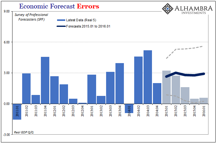
In other words, the near recession of 2015-16 wasn’t “unexpected” at all, but that raises another topical problem. What good is a medium term forecast where the boundaries for it are so broad as to be nearly meaningless? Are we really supposed to have considered that GDP in 2016’s first quarter could have been better than 5% in equal chance to the lower number that did result?
The US economy at 5.5% is so completely unlike the one that is now estimated (the low end) that these figures are at best meaningless, at worst misleading (as they were especially in contemporary mainstream use).
The Federal Reserve has already started to use fan charts in some of its presentations, including materials released in combination with certain monetary policy statements. And they are often just as ridiculously unhelpful.
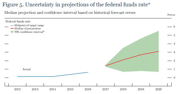
In the material accompanying the Minutes of the December 2017 FOMC meeting, for example, there are several of these such as the one pictured above. The Fed’s models seem to think the federal funds rate will be closing in on 3% next year, and in all likelihood that is all you will hear on the matter. But that’s not really what they say; rather, illustrated by the green shaded area, while they may predict 3% we should only expect that it will be somewhere in the range of 4.5% on the high side to less than 1% on the low side.
An economy of 4.5% federal funds next year is quite obviously nothing like the one possibly at 1%; the former is inflation taking off and the economy finally starting to behave after more than a decade like a normal one, whereas the latter is the same weak economy further heading toward another downturn or worse.
But there is one final problem with these scenarios as they are described in this way, and it’s the one that matters most. Using a confidence interval as we have already subjectively assumes an absence of bias. In other words, is there really an equal chance of 4.5% as 1%? We are using a standard normal distribution for forecast errors even though we’ve already shown this to be a problem.
Go back to the charts I provided at the outset. The biases are beyond detectable, they are downright visible.
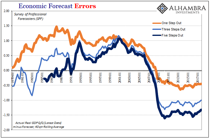
From the early eighties until the late nineties, the period encompassing what became known as the Great “Moderation”, the SPF forecasts for real GDP consistently underestimated economic growth. Starting around Q2 2000 (what happened in Q2 2000 again?), the systemic bias shifted until 2006 and 2007 when economic forecasts suddenly switched to being systemically overoptimistic (quite seriously in the longer range area).
That means since the Great “Recession” forecast errors are not evenly distributed at all but persist for the most part in the one direction (the very one Stanley Fischer in 2014 noted Economists had to keep apologizing for). Therefore, it is not as likely the federal funds rate will be 4.5% next year as 1% or less; or that GDP will be 6% versus 0%.
We also should note the changes in these biases. They align perfectly with the one governing factor none of these models take into account – eurodollar money. The economy performed better than expected especially when measured by subsequent benchmark revisions because of the growing influence of credit financed by offshore “dollar” growth.
The break in Q2 2000 (dot-com bubble top) initiated first the dot-com recession and then, more importantly, the giant sucking sound also financed by eurodollar system expansion. These greatly moderated economic growth in the middle 2000’s after economic models had normalized to conditions of the late nineties (including the idea that increased productivity growth would be permanent). The chronic over-estimation of recovery in the 2010’s is the unaccounted for drag of the lingering effects of intermittent global “dollar” dysfunction.
In short, not only do they really not know what they are doing, they also have no idea why they really don’t know. Like Ms. Mester, I am very much in favor of fan charts, and I would even go so far as to mandate only their use. There is nothing out there that might so perfectly portray these ideas like they would. The public really needs to see how ridiculous this all is, starting with how there is so little behind “transitory” (as if anyone couldn’t have just guessed) and data dependence at any timescale.
To the media, Jerome Powell’s Fed might be saying it is now thinking about the risks of an overheating economy and therefore the economy actually risks overheating. Using just fan charts, Powell would be required to note fed funds is as likely 1% as 4.5% next year. Using bias adjusted charts, he would have to further admit there is significantly less chance of 4.5% and considerably more at 1%. Perhaps in being forced to do so, he might even think to investigate, for once, why.
Stay In Touch