
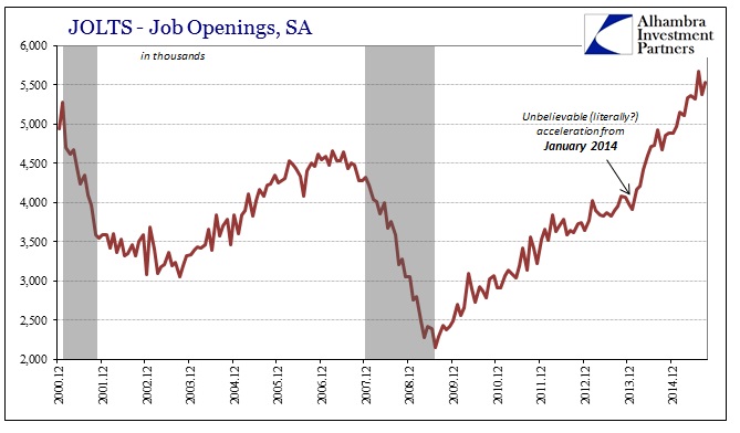
The updated JOLTS numbers for September just confirmed more nonsense on the part of the BLS. Job openings continue to be all their own while the rest of the data series, even as the whole is indexed to the CES, at best stagnates. On every other count, including hires and quits, there is something drastically different in the US labor market. The view from Job Openings, however, instead is quite imitating of the Beveridge Curve which is, in my view, a significant clue as to what might explain the growing discrepancy.
After declining last month by nearly 300k, “job openings” rose149k in September to nearly match July’s record. As you can see below, this data series took an unusually sharp turn starting with 2014’s Polar Vortex.
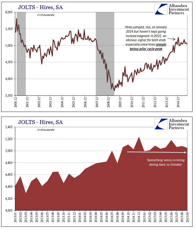
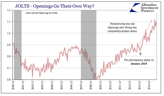
There was a similar increase at that time in “hires”, though of not nearly the same magnitude. In short order, the surge in job openings far, far outpaced hires not just in terms of the recent cycle but out of all proportion with the entire prior series. That discrepancy has only become much worse in 2015 as the estimated rate of new hires has languished quite conspicuously and below the prior 2005-07 cycle peak.
The BLS’s own estimate of labor flexibility, the quits ratio, has similarly stagnated with hires rather than confirming of job openings. If there were such a massive and unprecedented surge in actual job openings you would expect far, far more labor turnover as employees turn greater opportunity to their advantage. Similarly, you would expect a sharp rise in the labor force as those opportunities apply equally to those still, courtesy of this “recovery”, on the sidelines.
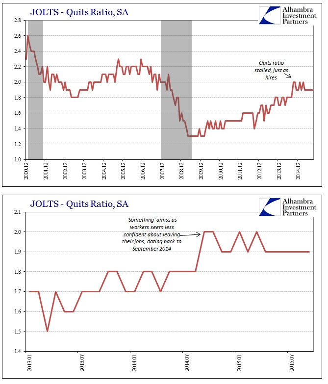
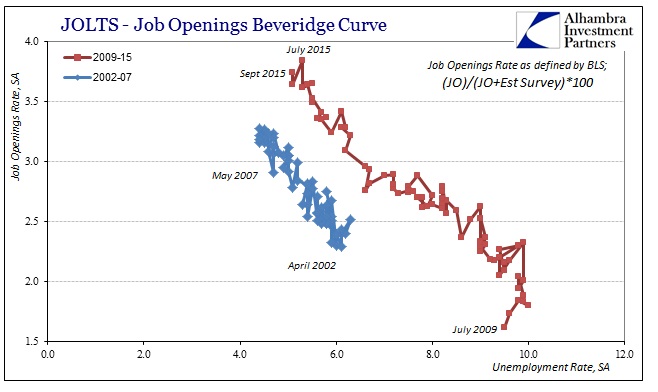
Neither is occurring, as you can see plainly above in the quits ratio and what the BLS reported for the “perfect” October jobs report that still shows a shrunken labor force for 2015. However, if you plot the job openings “rate” (as defined by the BLS) it still quite visibly fits within orthodox expectations for what the labor market “should” look like as outlined in the Beveridge Curve. Since the official unemployment rate remained steady at 5.1% in September, the increase in job openings continues the downward sloping track (or, more specifically, upward sloping from right to left).
Using the alternate version defined by the Federal Reserve, the job openings figures likewise fit quite well in the expected circumstance.
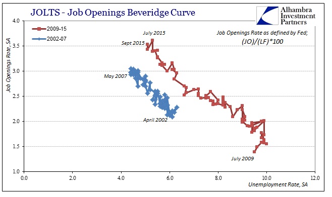
I think that defines what is “guiding” at least the subjective portions of the BLS’s labor estimates. These are stochastic processes being employed to estimate the count of “job openings” and therefore open up these figures to just such subjectivity. It seems increasingly clear that the Beveridge Curve expectations stand as almost a template by which the subjective interjections of BLS estimations are sticking out. That is particularly visible when using alternate versions of labor “demand” and “supply.”
Actually counting the participation problem, and thus normalizing the labor force not by its shriveled current view but what a real recovery would produce as consistent with all prior recoveries (the very basis for these very subjective statistics in the first place), the Beveridge Curve totally and completely falls apart.
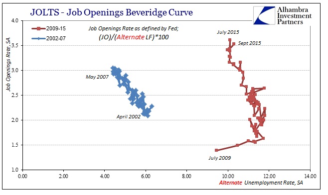
The “curve” as shown above, almost perfectly straight up and down, announces instead no tangible relationship between job openings and the more comprehensive “unemployment” view provided by including those unfortunately outside the official definition of “unemployed.” What that suggests is that no matter what job openings have done in the past almost two years since January 2014, it makes no correlation with the “supply” of labor. That is, as noted above, the view of both “hires” and now “quits” as well as the official labor force itself!
If there is no relationship between the actual labor force and job openings as presented by the BLS, then we can either assume that there is something wrong with actual labor (if job openings as a statistic are truly valid) or something wrong with the job openings as a statistic. Given hires, quits, the labor force, wages, spending, manufacturing, global trade, etc., etc., the simple explanation is as I proposed – the BLS is using an improper guide to create what amounts to a fictitious figure because they don’t know what else to do at this point. More than six years into a recovery is not supposed to be so languishing, so a further turn against even that meek recovery at this point into possibly looming recession is unprecedented.
The seemingly solid and immutable relationships that governed and defined these stochastic processes in the past have been obliterated by the “unexpected” deviations all over the economic spectrum in this asymmetric “recovery” and particularly this clearly amplified departure in 2015. In July 2013, the former head of the BLS, Keith Hall (who left in 2012), told the NY Post that,
“This has been a very slow, very bad recovery,” he says. “And I think the numbers have really struggled as a result. In fact, I’ve been very disappointed in the coverage of the numbers.”
When all your “seasonal adjustments”, which include elements like trend-cycle, are based upon recoveries that look nothing like the current version the “numbers have really struggled as a result.” With what has happened in the past year and a half, it really isn’t surprising that might have not just continued but grown worse and in more obvious ways. That skew would be applied not just to job openings, but hires and quits that might be worse than the lack of progress officially presented (which would be far more consistent with a sharp and accumulating slowdown in spending) – as well as the Establishment Survey itself, all perfection especially included.
Stay In Touch