
I missed durable goods last month for scheduling reasons, which was a shame given that May is the month each year for benchmark revisions to the series. Since new estimates under the latest revisions were released today, it seems an appropriate time to revisit the topic of data bias, and why that matters.
What happens with durable goods (or any data for that matter, the process is largely the same) is that the Census Bureau conducts smaller surveys to compile sample totals. From these they derive and estimate monthly changes. These are the numbers you see described in the media and referenced by economic commentators.
What you don’t ever see is what happens afterward. You may think that the estimate for durable goods in, say, September 2014 is the estimate for durable goods in September 2014. It’s supposed to be close no matter the sample size, and usually was, which is why nobody bothered to pay much attention to these processes before 2008. I certainly didn’t care.
For durable goods and the manufacturing sector in general, the Census Bureau supplements its monthly surveys with a yearly one. The Annual Survey of Manufactures is drawn from a much larger sample audience, where this more comprehensive data is used to come up with a benchmark annual anchor from which the monthly estimates for the following year can be spliced on to. If there is no bias in the monthly data, the benchmark changes should be small; the larger sample confirming the assumptions embedded within the more frequent one.
We don’t often think about bias in economic accounts since it appears in every way to be objective math. Again, it may have seemed that way in the past but what has been revealed over the last half decade is just how biased these estimates can become. I don’t mean to suggest that government officials are intent on making their bosses look good by pumping up stats. What really happens is that these economists (small “e” statisticians) have to make some key assumptions before checking them with these larger more comprehensive samples. There’s no getting around this potential deficiency.
The biggest one is what should be the least controversial – trend-cycle. As we are taught from the very beginning of Economics 101, an economy is either growing at or near trend, or it is in recession. And if it is coming out of recession, it goes right back to trend. There is, in orthodox theory, no in between.
Statistical analysis as it relates to trend-cycle follows that same binary approach. Thus, any period relating to a recession is expected beforehand to follow the familiar “V” shape. Short period estimates such as the monthly durable goods number are given this general outline at the start of each benchmark, and then corrected as needs be with each larger annual sample.
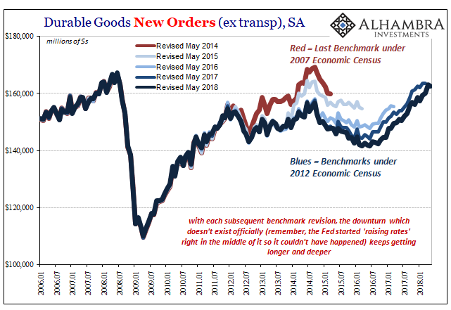
The biggest survey is the Economic Census conducted every five years. It is the most exhaustive and complete economic accounting, and therefore what the Census Bureau finds within it becomes the gold standard for where each economic account actually may be in time.
The current benchmarks all derive from the 2012 Economic Census, which began to be incorporated in the estimates (for durable goods) starting with 2014 benchmarks. The 2017 Economic Census is, the Census Bureau reports, nearly finished and will start to show up in certain figures next year.
The 2012 Economic Census, however, registered an unexpected break from the 2007 version. Some accounts saw downward benchmark revisions for months during the Great “Recession” itself, but by and large what became more normal with 2014 and 2015 revisions is that the “recovery” began to slowly disappear.
Again, related to trend-cycle, nowhere was the overestimation more egregious than in the durable goods report. The only other series that has been close to displaying so much positive bias is Industrial Production, a data set maintained and compiled by the Federal Reserve. That these are two separate series both related to manufacturing and industry and both hugely biased upward before being checked by the 2012 Census pretty much confirms the nature of the problem.
Under the May 2014 series, the last to be anchored to the 2007 Economic Census, durable goods experienced what appeared to be an almost normal recovery. The pattern, at least, followed somewhat along the lines of the usual “V” shape. It wasn’t great in 2013, but by 2014 manufacturing conditions looked to be heading in that direction.
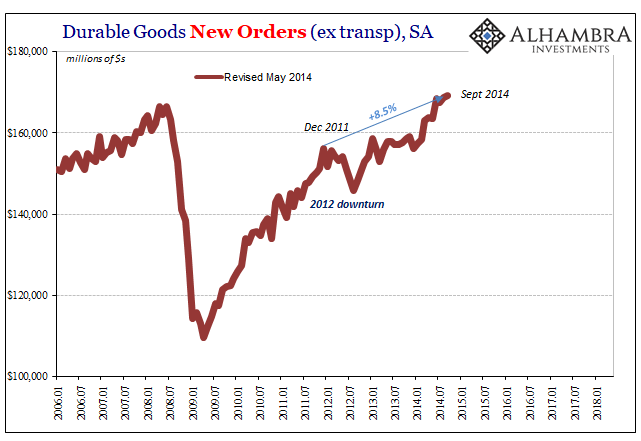
A nearly 9% gain over just about three years is far from robust, but according to these figures it did appear to be just a matter of time – and a little more QE.
The following benchmark, however, kicked off the hidden statistical nature of this “recovery.” The level of durable goods orders was at first lowered particularly in the immediate aftermath of the 2012 downturn. The net effect was some higher growth rates for those first few months of 2014, but overall a smaller upswing than previously believed.
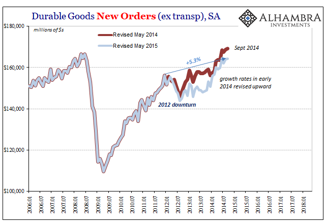
If you thought QE3 and Draghi’s promise were effective monetary policy responses to the developing downturn, then you might have been assuaged by the initial estimates without ever considering how they may not have been consistent with actual conditions; more statistical mirage than marketable growth.
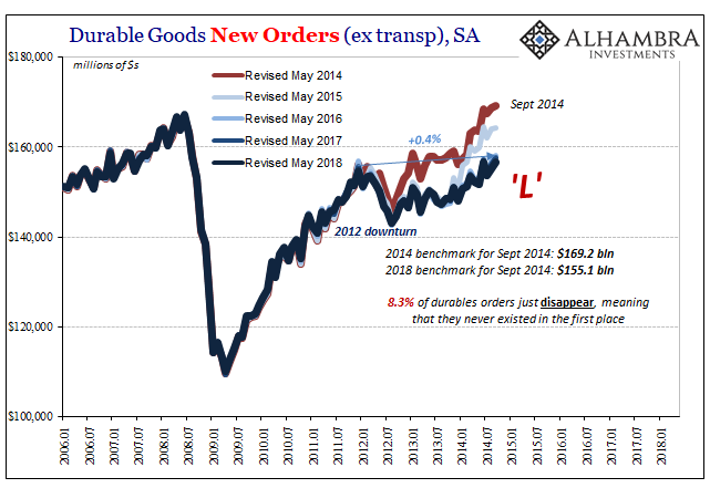
Further benchmark revisions following the 2012 Economic Census have merely erased the totality of that upturn. As of the latest downward revisions released last month, durable goods during that reflationary period now show almost no recovery at all. This is the entirely too familiar “L” pattern that doesn’t exist in the Economics textbook – meaning that it required a great deal of additional effort to overcome that bias and move closer to what is in all likelihood the true economic state.
This predisposition hasn’t been limited to overaggressive optimism during these expansion portions, either. The contamination has been consistent throughout, repeated as a second “unexpected” downturn developed in late 2014. It was unexpected in many ways because of these hidden revisions process, where the potential for biased data was never incorporated into mainstream analysis (such that any rational analysis was ever conducted).
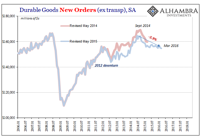
The original benchmarks had it as largely limited to late 2014 and early 2015, but starting already from a much lower peak. Over the following years, additional surveys have found what actually amounted to this manufacturing recession that has grown in both length and depth.
In truth, it didn’t do any such thing, rather it took more complete information for the Census Bureau to recognize only years afterward what had already happened. Why did the FOMC unleash its first “rate hike” in a decade during the middle of this downturn? In one part, incomplete and biased figures (including IP, which is one of the four major statistics that the NBER might have used to date the business cycle, if we were any longer within one).
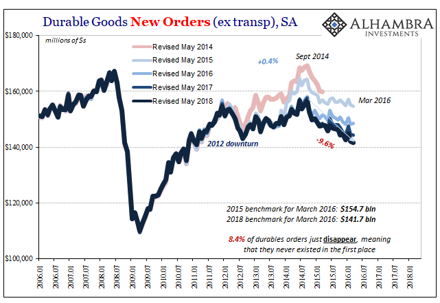
A 10% contraction lasting more than a year and a half is not something you normally find outside of full-blown recession. It seems trivial today that however substantial it might have been, it’s over now.
That 2015-16 downturn having run its course, we are left to ponder the state of the current upturn. It is already in many ways exhibiting similar proportions to the prior one -under the 2007 Economic Census. In other words, are durable goods actually rebounding as they might appear to be right now?
Revisions over the past few years up to and including the latest in May 2018, all still under the 2012 Economic Census, suggest over-estimations are still endemic. If the “L” in 2009-10 didn’t convince them, the one in 2012 wouldn’t have, either. Thus, the new benchmarks still move in an almost “V” when there are considerable doubts that’s really the trend.
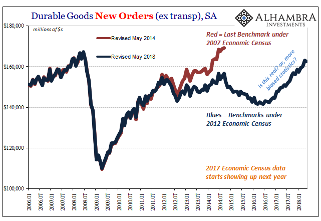
What might we find out in 2019 as the 2017 Economic Census enters the picture, which will have incorporated actual business experience during the 2015-16 downturn?
While this bias is most evident in durable goods, the effects of these revisions are not limited to just this one series, or the two including IP. There were substantial benchmark revisions in GDP, among others, again pertaining to the “unexpected” 2012 downturn and its immediate aftermath.
The bigger question as it relates to what’s going on now is something like market prices differing from the narrative. The yield curve, for example, was conspicuously pessimistic in 2014 despite what looked like in many accounts, including durable goods, an almost robust acceleration. In the hindsight of the Economic Census as well as benchmark revisions, reality has been revealed to have been far more like the UST market than the dominant narrative.
People in 2018 should take heed. There aren’t any mainstream articles written about how durable goods orders just disappeared from the accounts years afterward. If the number for whatever month is X, then most take it as X, incorporate it into their view, and move on to the next thing and the next month.
That’s how you can get a boom that isn’t a boom, a recovery in idea that doesn’t hold up in history. In other words, it matters a great deal that even years later there are always more “L’s” than the near “V’s” the numbers first show. Thus, what should we expect of any upturn post-Great “Recession?” Booms, or “L’s?”
Stay In Touch